Guest blog by Brian Patrick Flynn
Atlanta-based interior designer
In 2015, after having bought and renovated two houses in five years, I found my forever city home, a 1965 midcentury modern ranch in Atlanta. And while my first two ventures into real estate had massive windows and loads of natural light, this one, well, it was the opposite. Due to its formal layout focusing on dozens of separate, privatized spaces, the house was packed with super dark areas, specifically an extra-long hallway on the main floor void of windows altogether. And although its mature landscaping was a selling point, the tree canopy outside actually made the interior darker.
As I put a design plan together for the second phase of remodeling for the house, I decided to focus on the fifth wall as much as possible, something I'd been doing since starting my career as a self-taught designer (I cannot stand a blank, flat white ceiling). This would include raising ceilings, incorporating skylights and Sun Tunnels, and resurfacing ceilings with architecturally interesting materials. Lastly, as a color-loving designer, I wanted to infuse high energy hues into the house but only in areas with enough natural light for the colors to read correctly. Equipped with a palette of ultra-white, jet black, electric blue, teal, earthy greens and neutral greys, my team and I embarked on a 10-week project to lighten and brighten this diamond in the rough.
Kitchen
Overall, I really wanted the kitchen to feel open and airy and really showcase the lush tree line that surrounds the house. After adding new cabinetry and covering the space in ultra-white, I installed massive steel and glass casement windows, and then brought light in from above with skylights in the main working area and also in the extra tall pantry. With light coming in from both directions, the previously dungeon-like galley kitchen stays gorgeously lit all day long. Since white reflects light, I also wanted to make sure I could control it from becoming too intense, and that's where light filtering skylight blinds come in handy as they diffuse the rays when the sun is directly overhead. To avoid the pantry feeling like a dark corner or an afterthought, I decided it also needed a skylight, something that would make it more inviting and also bright and cheery like the rest of the space. Anytime I choose an all-white color scheme, it's important to let natural light and architecture remain the star.

Natural light from the skylight heightens the modern vibe.
 The skylight makes this modern pantry an ideal prep area.
Guest bedroom
Color was the name of the game for the guest bedroom's design. Since it's a space that will only be used several weeks a year for short-term guests, it was the perfect opportunity to experiment with a palette that could be overwhelming in a larger, more communal area with higher traffic. After raising the ceiling nearly two feet, I was able to create a vaulted vibe and pack in some interior architecture with a tongue and groove ceiling painted out white to help reflect more light. A pair of skylights allow guests to look up from the bed to a perfectly blue sky framed with mature trees. The skylights are also the reason the electric blue reads as bright and energetic rather than dark and moody. And since any colors you see together outside in nature also work perfectly indoors for interior design, I stuck with bold pops of grassy, kelly green as the room’s accent color, both in accessories and the integrated green skylight blinds. Additionally, if my guests decide they want to sleep in, they can close the skylight blackout blinds all the way. In the event guests prefer to skip an alarm clock altogether, they can also program the blinds to open at the same time every day for a more peaceful wakeup method.
 Inspired by tree canopies against the blue sky, this bedroom's color comes to life under natural light.
Foyer
When I first bought the house, I imagined its entry eventually doubling as a massive art gallery. In its original state the entry was dark and low. By installing a 14-foot-tall steel and glass front door, then brightening up a back corner with a skylight, the saturated colors in many of the pieces would read true to their values. And since there's a good amount of electric blue in the art, I chose that as my bold color for the skylight blinds. In addition to helping with aesthetic elements, the skylight also helps with air flow since it sits in the center of the house and can be opened and closed with a remote.
 Bring out the best in your gallery wall by adding natural light.
Hallway
Sun Tunnel skylights were the main design element for transforming the hallway. I chose a super textured raffia for the walls, and in order to be able to see the woven construction it needed plenty of natural light shining down on it. Since adding the Sun Tunnel skylights, the space is now almost museum-like, and I could either keep the hallway light, bright and architectural by keeping the walls bare, or I can continue the gallery like look by hanging a few key art pieces.
 Sun Tunnel skylights brighten an otherwise dim hallway.
Design studio
When designing homes and products, I need a space that's quiet and open to nature. Fresh air makes a massive difference when I'm playing with architectural plans, palettes, textiles and furniture. Completely remodeling an old potting shed into my full-fledged design studio allowed me to pair French doors looking out to my lush yard with skylights above looking up to the blue sky and verdant tree limbs. With so much natural light, the studio is ideal for playing with colors. When the weather is gorgeous in the spring and the fall, I can simply open the skylights for air flow. Pure white skylight blinds are excellent for keeping the light diffused, something fantastic for photo shoots and helping clients see how colors read when paired together.
 Skylights make the backyard design studio functional and beautiful.
Guest and master bathrooms
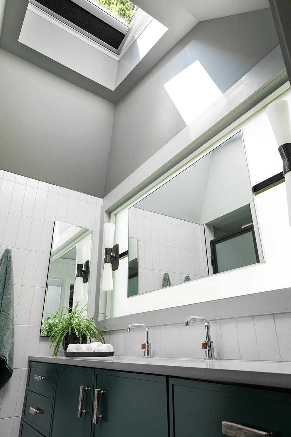
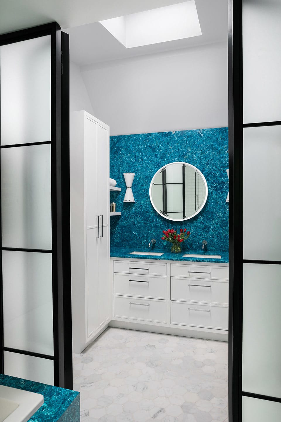
Although both of the bathrooms on the main floor are smaller in size, they didn't need to be short on style. I raised the ceilings in both bathrooms approximately two feet and gave them a vaulted look. After installing skylights in the bathrooms, both were contenders for deep, rich colors that could overwhelm larger spaces.
My guest bathroom is the smallest space in the house, but also the lightest and the brightest. The walls and floors are pure white, but there are surprising pops of saturated hues including a teal vanity backsplash and bold fire engine red blinds integrated into the skylight. I decided to keep my master bathroom neutral and, for the most part, grey scale. The walls and ceiling are covered in a medium grey while the dark geometric floors coordinate perfectly with the charcoal grey skylight blinds.
The skylights are also super essential from a functional standpoint in both bathrooms as they help with air flow during or after steamy showers. It's also amazing to start each morning seeing the bright blue skies above.
 With a translucent window and a skylight, the bathroom above is filled with light.
 Without natural light streaming in from above the aqua backsplash would be lost in the dark.
For more design inspiration follow Brian Patrick Flynn on Instagram @bpatrickflynn.


